REBUILDING THE BRAND
Previously known as “ListenUp OKC”, The SoundBar was having trouble with its identity; “what does Listen Up even mean?” The owner decided to simplify the branding, removing the area tag and combing the two main features of the business; the sound and the bar. With this new name, the branding would also have to be rebuilt to reflect this new identity.
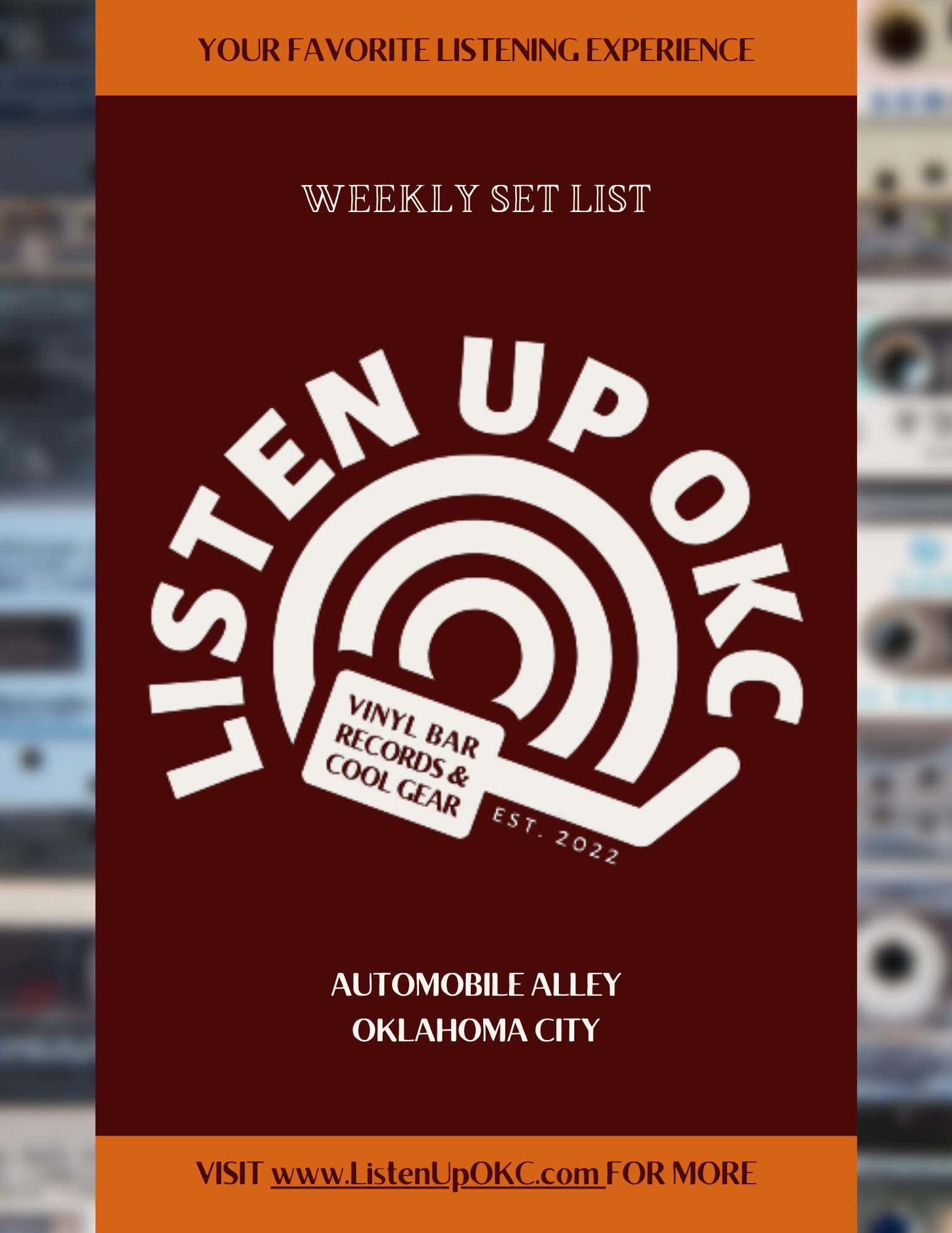
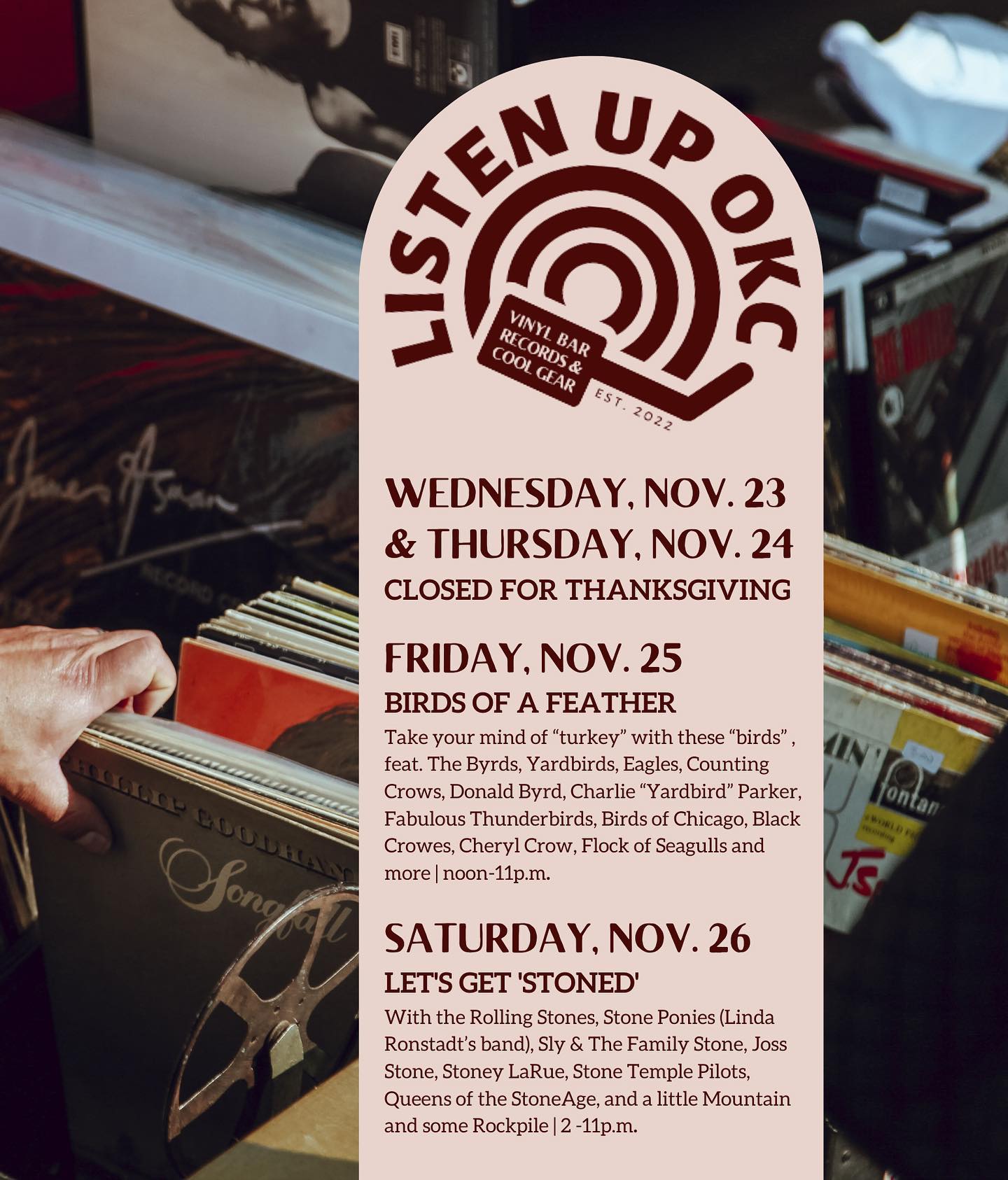
Old Branding // previous logo, logo poster, and weekly setlist
This new direction would focus more on variety, color, and subtle uses of both the branding and the vinyls themselves. The “football helmet” logo would be replaced with a more modern font and simplified icon that can stand alone.
Refreshed Branding
The client wanted a multiple different styles of logos, so the brand consists of a wordmark, stacked wordmark, disc icon, and jacket icon (mostly in the event that the business would expand and require a more compact wordmark/icon combination for things like wrapped and stickered vinyls for purchase).
Feel free to download the brand guide


New Assets & Colors
Accompanying the new branding were new assets and new colors. These assets play on both the “swoosh” from the disc icon and the abstract imagining of the grooves of a vinyl disc. An alternate asset for the swoosh is the “glass swoosh” which mirrors the material used to wrap vinyl (glass just sounds better than plastic. View the navy SoundBar poster below for an example). The client wanted both “warm and inviting” colors for the summer and fall and “cool and comforting” colors for the winter and spring.


POSTERS & WAYFINDING
With a weekly playlist that rotates, The SoundBar needed a poster that could provide a space for a smaller playlist calendar and general information about what The SoundBar is. The space also sits on the second floor and needed some general wayfinding for newer patrons.
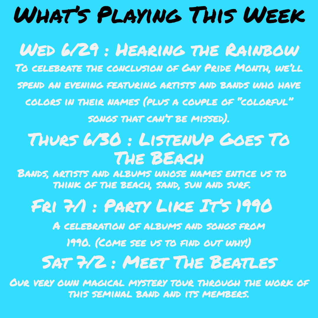
Weekly playlist calendar.
Weekly playlist board and general info.
General wayfinding poster for the downstairs area.
BUSINESS CARDS
Utilizing all of the colors within the specified branding to represent the wide variety of options at The SoundBar. Guests can come to lounge, listen to music, buy drinks, or purchase gear and equipment.
WEBSITE
The design of “thesoundbarokc.com” was inspired by vinyl records, with images “stuttering” or “skipping” and
an overall dark and cozy atmosphere that really invites the visitor to experience The SoundBar before
they’ve even arrived.
Built using Wordpress and Elementor, the website hosts a weekly playlist “Now Playing”,
a drink menu, an events page for booking, a resources page for audiophiles, and your standard news and about
pages for more information specific to The SoundBar and what’s going on.